Loading...
Loading...
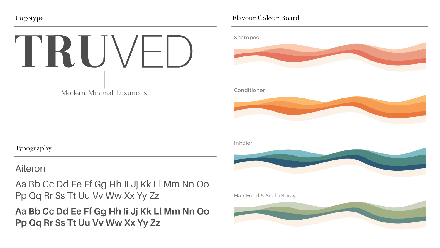
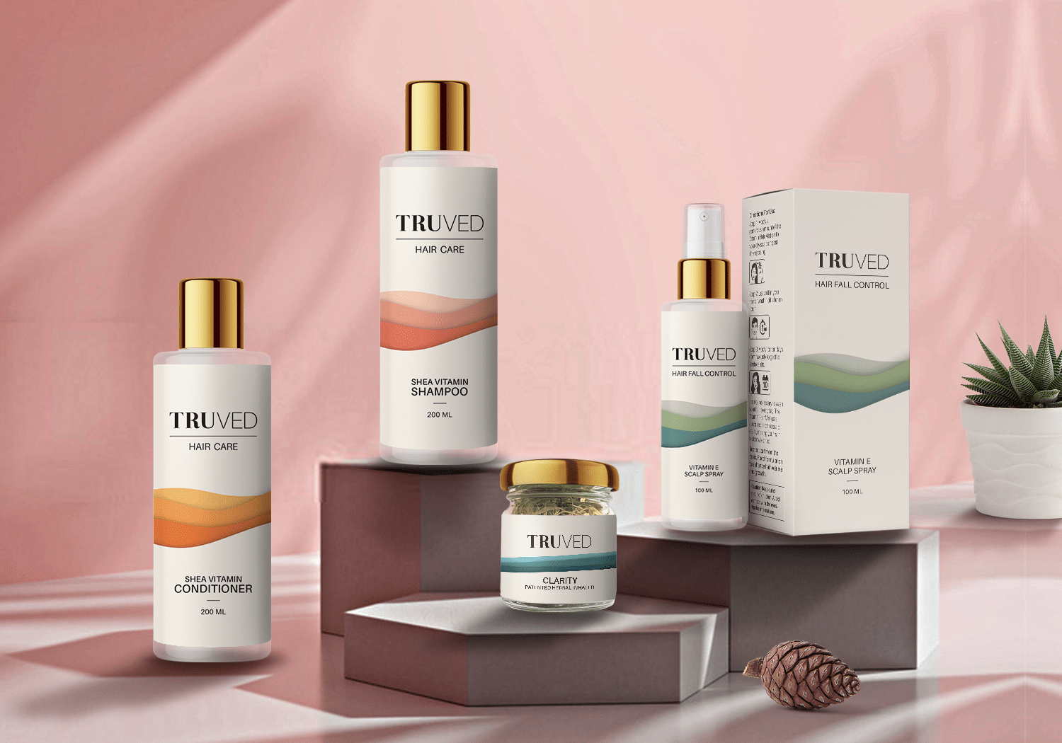
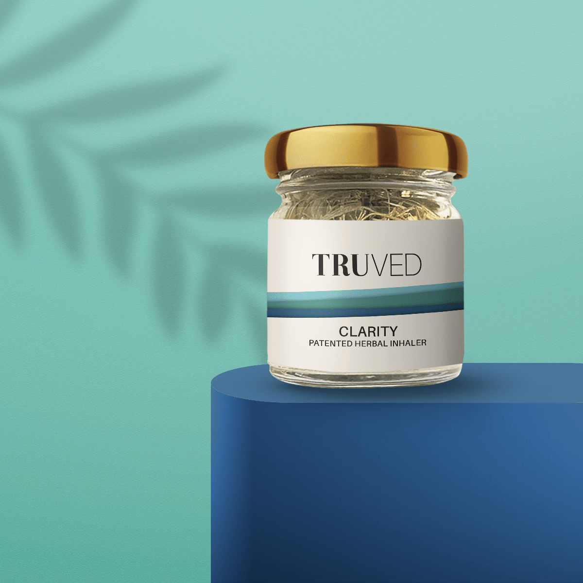
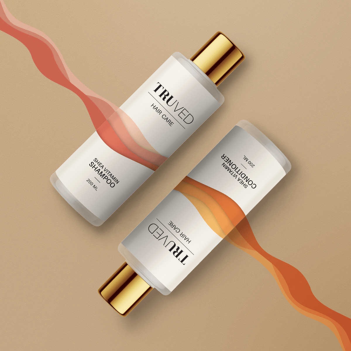
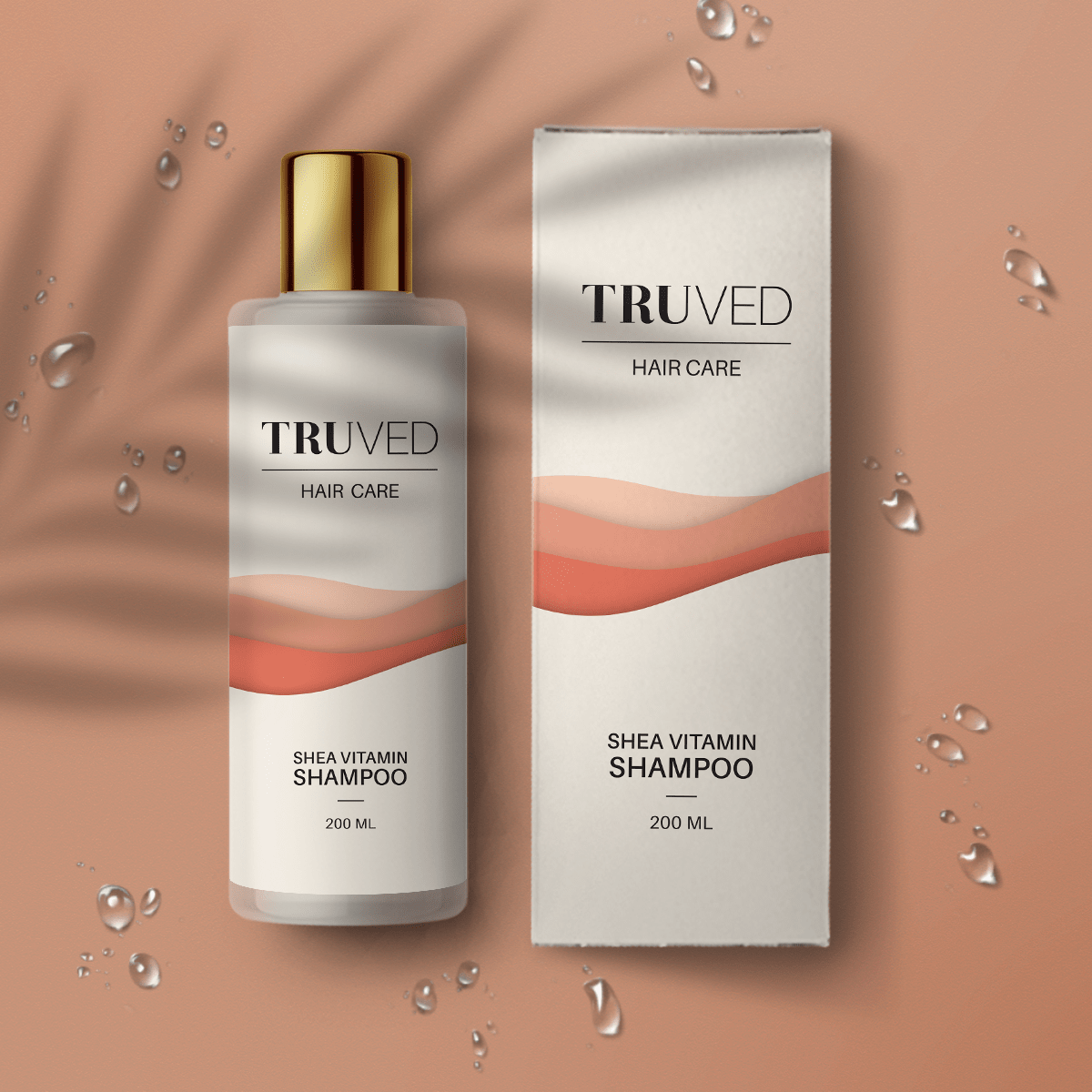
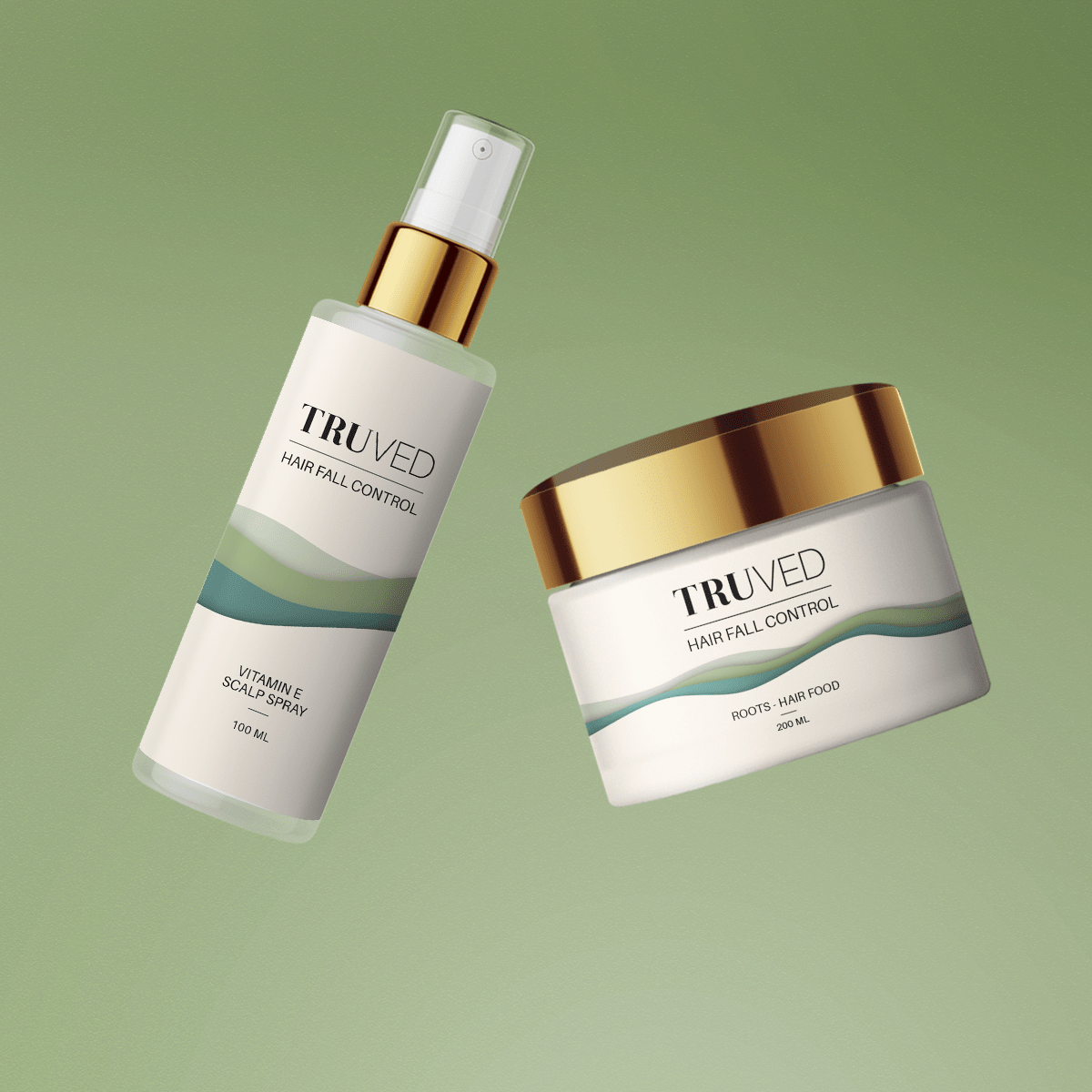
Truved is an affordable luxury brand that houses haircare, skincare and body care products that are made from ayurvedic ingredients using ayurvedic formulations. As per the brief, the essence of the brand identity was to create modern, minimal and luxurious retail experience for their international client base and not the traditional look and feel of an Ayurvedic brand.
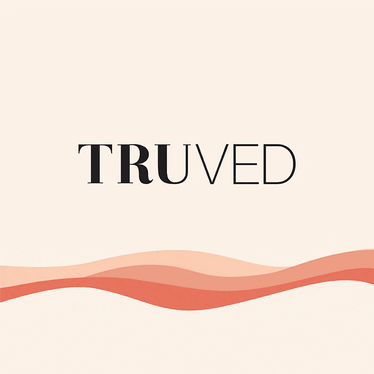
The name Tru stands for “True” and Ved is from “Ayurveda”, putting them together gave a brand name with a direct association to the category, at the same time staying true to their organic and natural ethos.
An identity system that has been developed keeping in mind luxury as well as simplicity. Hence, the typography logotype, “Tru” is in bold font grabbing attention and “Ved” is in thin font addressing luxury. We suggested a wave pattern in order to communicate the fluidity, smoothness and flow that the brand stands for. The usage of pastel colors along with the brand pattern creates a seamless brand language.