Loading...
Loading...
The novel COVID-19 pandemic has created a unique situation in the world that we all call the world of “new normal”.
There are many measures being taken to contain the virus but there were questions and worries “How can one protect oneself from the coronavirus in this new normal world until a safe, effective coronavirus vaccine is available?
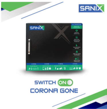
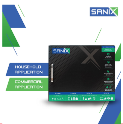
Eseskay Projects realized the need for an hour and ventured into launching a UV-C Sanitization box that one can use for a quick, easy and safe sterilization of all their personal, household and commercial belongings on daily basis. They approached us and asked us to lay the foundation of the brand beginning with the brand name, to its personality and visual language and we worked in close collaboration with the founding team to develop a brand language and packaging that pushed the boundaries of perception within consumers’ minds.
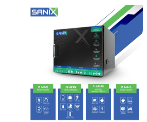
The core objective of the product is to sanitize the items placed inside the box with the help of ultraviolet rays.
It basically means it kills the virus/ germs with the help of UV rays, which will be on the surfaces of the items placed inside the case.
The name is also suggested by combining two words
Sanitizer + Nix
San’ stands for Sanitizer and ‘Nix’ is a synonym of the word Nil which stands for virus/germs free.
Keeping this thought in mind, have suggested the logo that communicates Nil/Nix/ Zero / Wipeout of the germs with the help of the box.
Here, “X” stands for the complete wipeout of the germs and have highlighted the same in green color which communicates virus-free.